Guide to color scheme in email
At the end of 2019 and around the start of 2020, color-scheme was introduced to CSS to allow developers to better support their users by respecting the user's preference for either a light or dark color scheme. It’s not always just down which version a user likes more, there are accessibility benefits to both light and dark mode. Depending on the user's condition, it’s also been found that switching to a dark color scheme can save on power.
Supporting color schemes has been very successful on the web and in apps; however, in email, it’s a different story. Although some email clients have great support for allowing senders to provide this enhanced experience, they are still in the minority. What is particularly tricky is some email clients will force a dark theme by changing some of the colors in the email.
This is the same approach you’d use for a website.
First up, we need to tell the email client which color schemes we would like to support. This can be done with either a <meta> tag or in CSS.
The CSS version has better support but I like to include both. As email client support grows, there may be some edge cases that support <meta> and not CSS. To support older versions of Applemail 10 you can also include <meta name="supported-color-schemes" content="light dark">.
The value I’m using here light dark is saying that my default color scheme is light, but I’m also providing a dark version.
If you want only to support light and to try and stop any auto conversion of color scheme, you can use only light although support for that is even smaller and generally, it’s recommended to respect your user's preference and supply both where possible.
Styles are added in a media query, just like we do for responsive designs using @media (prefers-color-scheme: dark) or @media (prefers-color-scheme: light) to provide the styles.
An image can be swapped by using the HTML <picture> element. Support for this is a little less than the prefers-color-scheme media query, so it’s not ideal, however, it’s not very much code, so easy to implement to get a small enhancement where it works.
This is where an email client will edit the source code of the email to try and provide a dark color scheme. The goal here for email clients is to provide the user with their preferred color scheme without relying on the sender to provide the necessary code. It’s a good idea in theory, and it looks like it may be extended to browsers too. However, in practice, we’ve seen it often causes display issues and can even end up with an email that is completely unreadable.
So, how can we ensure that our email content is readable when it’s difficult to know exactly what the email client might do to it?
At the time of writing, we’ve not seen any implementation of a forced light mode.
If the user said they want dark, we should respect that. It’s frustrating that it feels like the email clients are fighting us on providing these styles, but we have to work with what we have. So here are a few tips for working with forced dark mode and not against it.
Color changes can be unpredictable across different email clients, so stick to black and white and shades of grey. This can feel quite limiting so we can expand that recommendation to say this rule only needs to apply to text and ensure you have a strong color contrast. You can then add colors around that.
For example, this design is still very bright and colorful even though it uses black text on a white background.
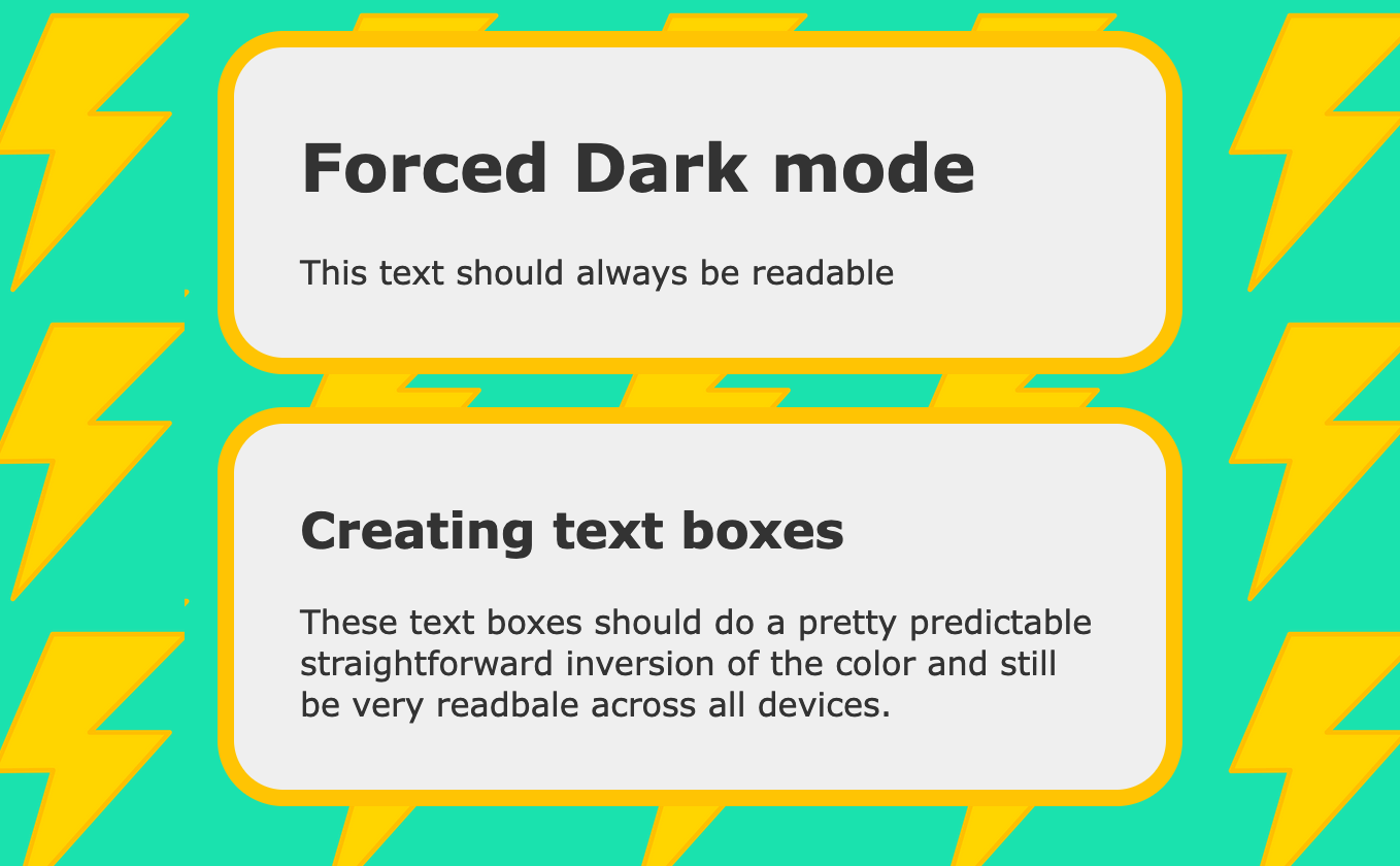
When viewed in forced dark mode some of the colors do change but the text still has a good contrast and is still very readable.
Make sure transparent images stand out
Transparent images such as logos are at risk of blending in to the background as the color changes. To work around this we can add a thick stroke or a background around the image. This could even be set to match the default background color so it doesn’t show up on the default design.
If we were to look at a simple logo like this that appears on a plain white background.

When we view it on a dark background, we lose a lot of the contrast, and it almost disappears.

However adding a thick stroke will help make it stand out again.

You could even get creative with a background shape to make it look more intentional and less like a workaround.

Using white in the background like this means the light version of the email will still appear to have the simple text logo, it’s only when the background changes that we see the difference.
Blend images into the background with transparency
It’s a common design trend to match the background color of you email with the background of an image so the design flows seamlessly. However when the background changes this can leave a jarring break in the design. Here we can edit the image to fade out to a transparent background so as the color behind it changes it will still blend in smoothly.
Another option here is to create a shape for the background to make the change intentional or even just adding border radius can help.
Looking at this example layout with the image on the right blending into the white background.

Switching to dark mode the transition of background feel harsh:

Adding some transparency to the left of the image and a slight border radius to the right makes it blend much better without affecting the look of the light version.

If all else fails as a last resort there are a few tricks we can use to get out of tricky situations. It’s best to avoid hacking things like this as things can change without notice and hacky code tends to be more unpredictable and could cause issues in any email client, even when you’re targeting one specifically so use with caution.
The easiest way to force a background color is to use a background image. This can just be a small image in your chosen color repeated to fill the space. However as our friend Jay Oram pointed out this image needs to be at least 60px by 60px or Gmail will still inverting the colors.
It's important to remember that any text on top of this background is likely to change color, so forcing a background could make the text unreadable.
Rémi Parmentier found that using CSS mix-blend-mode filters it’s possible to force some text colors in Gmail. Here’s a quick code sample to to fully understand it I recommend reading Rémi’s article Fixing Gmail’s dark mode issues with CSS Blend Modes.
When Outlook webmail forces dark mode onto an email it will keep the original colours stored in data attributes data-ogsb for a background color and data-ogsc for a text color. We can use these attributes to target certain elements. However there are a couple of catches.
The new styles are applied inline and with an !important flag so there is no way of overriding them directly on the element. Instead we can place an extra element inside the one that has the styles on it and apply the styles there instead.
Also any new colors we provide will have the same forced dark mode filter put on them so we can’t be exact with our new colour replacements. However we can tweak things a little. I’d recommend trying a few colors at once then sending a test and seeing what works.
All together that code might look like this:
When that code gets rendered in Outlook, it will look like this:
Out light aqua color of #3ef has been converted to a dark teal rgb(0, 75, 92).
With this technique, we can also do things like swapping background images or even applying things like background-blend-mode or mix-blend-mode to images to try and help them stand out if you find them fading into the background.
There are more hacky workarounds available and new things coming up all the time but these are the main ones that come up.
For more information on dark mode, and how email clients are impacted differently, check out our Guide to Dark Mode.